Attributes
The goal of the following document is to enumerate the different fields controlling design attributes in the SDK. If a clearer view of which attribute corresponds with a design element is needed, please utilize the Attributes Design Sheet.
User Bubble
| Name | Type | Description | Example | Default |
|---|---|---|---|---|
| remoteUserBubbleBackgroundColor | UIColor | Color code for the background of the remote user bubble. | 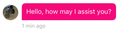 | #004DC9 |
| remoteUserBubbleBorderColor | UIColor | Color code for the outline color of the remote user bubble. | 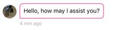 | #004DC9 |
| remoteUserBubbleLinkColor | UIColor | Color code for links in the text of the remote user bubble. | 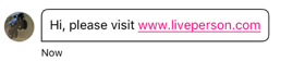 | UIColor.white |
| remoteUserBubbleTextColor | UIColor | Color code for the text of the remote user bubble. | 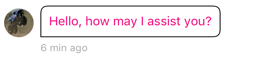 | UIColor.white |
| remoteUserBubbleBorderWidth | Double | Double number for the outline width of the remote user bubble. | 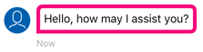 | 2 |
| remoteUserBubbleTimestampColor | UIColor | Color code for the timestamp of the remote user bubble. | 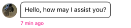 | #5B5C5E |
| remoteUserTypingTintColor | UIColor | Color of the remote user typing bubbles animation. |  | UIColor.white |
| remoteUserBubbleLongPressOverlayColor | UIColor | Color of the remote user bubble overlay when user uses a long press gesture on the bubble. Overlay will appear as long as the menu controller appears on the bubble. When the menu dismissed, overlay will disappear too. In order to show overlay, enableBubblesOverlayOnLongPress should be true. | 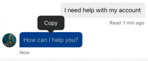 | UIColor.black |
| remoteUserBubbleLongPressOverlayAlpha | Float | Alpha of the remote user bubble overlay when user uses a long press gesture on the bubble. Value can be 0.0 - 1.0. Overlay will appear as long as the menu controller appears on the bubble. When the menu is dismissed, overlay will disappear too. In order to show overlay, enableBubblesOverlayOnLongPress should be true. | | 0.3 |
| remoteUserBubbleTopLeftCornerRadius | Float | Top left Radius corner on the remote userbubble. Setting the radius to a value greater than 0.0 causes the bubble's layer to begin drawing rounded corners on its background. This attribute affects the bubble's masking and it's recommended to use a corner radius which is at max equals to half of the bubble's height. Setting a corner radius larger than half of the bubble's height will cause text to cut visually. | 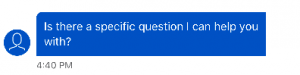 | 8 |
| remoteUserBubbleTopRightCornerRadius | Float | Top right Radius corner on the remote user bubble. Setting the radius to a value greater than 0.0 causes the bubble's layer to begin drawing rounded corners on its background. This attribute affects the bubble's masking and it's recommended to use a corner radius which is at max equals to half of the bubble's height. Setting a corner radius larger than half of the bubble's height will cause text to cut visually. | 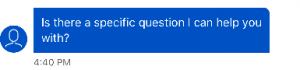 | 8 |
| remoteUserBubbleBottomLeftCornerRadius | Float | Bottom left Radius corner on the remote user bubble. Setting the radius to a value greater than 0.0 causes the bubble's layer to begin drawing rounded corners on its background. This attribute affects the bubble's masking and it's recommended to use a corner radius which is at max equals to half of the bubble's height. Setting a corner radius larger than half of the bubble's height will cause text to cut visually. | 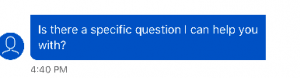 | 8 |
| remoteUserBubbleBottomRightCornerRadius | Float | Bottom right Radius corner on the remote user bubble. Setting the radius to a value greater than 0.0 causes the bubble's layer to begin drawing rounded corners on its background. This attribute affects the bubble's masking and it's recommended to use a corner radius which is at max equals to half of the bubble's height. Setting a corner radius larger than half of the bubble's height will cause text to cut visually. | 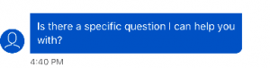 | 8 |
| userBubbleBackgroundColor | UIColor | Color code for the background of the visitor bubble. | 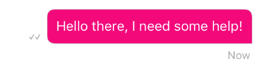 | #EDEDED |
| userBubbleBorderColor | UIColor | Color code for the outline color of the visitor bubble. | 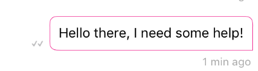 | #EDEDED |
| userBubbleLinkColor | UIColor | Color code for links in the text of the visitor bubble. | 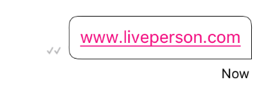 | #0000ee |
| userBubbleTextColor | UIColor | Color code for the text of the visitor bubble. | 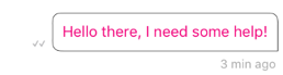 | UIColor.black |
| userBubbleBorderWidth | Double | Double number for the outline width of the visitor bubble. |  | 1 |
| userBubbleTimestampColor | UIColor | Color code for the timestamp of the visitor bubble. | 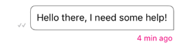 | #5B5C5E |
| userBubbleSendStatusTextColor | UIColor | Color code for the send status text of the visitor bubble. | 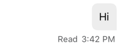 | #5B5C5E |
| userBubbleErrorTextColor | UIColor | Color code for the error view text of the visitor bubble. | 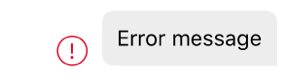 | #DE0A23 |
| userBubbleErrorBorderColor | UIColor | Color code for the error view border of the visitor bubble. | | #DE0A23 |
| userBubbleLongPressOverlayColor | UIColor | Color of the user bubble overlay when user uses a long press gesture on the bubble. Overlay will appear as long as the menu controller appears on the bubble. When the menu is dismissed, overlay will disappear too. In order to show overlay, enableBubblesOverlayOnLongPress should be true. | 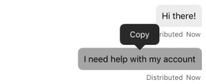 | UIColor.black |
| userBubbleLongPressOverlayAlpha | Float | Alpha of the user's bubble overlay when user uses long press gesture on the bubble. Value can be 0.0 - 1.0. Overlay will appear as long as the menu controller appears on the bubble. When the menu is dismissed, overlay will disappear too. In order to show overlay enableBubblesOverlayOnLongPress should be true. | | 0.3 |
| userBubbleTopLeftCornerRadius | Float | Top left Radius corner on the User bubble. Setting the radius to a value greater than 0.0 causes the bubble's layer to begin drawing rounded corners on its background. This attribute affects the bubble's masking and it's recommended to use a corner radius which is at max equals to half of the bubble's height. Setting a corner radius larger than half of the bubble's height will cause text to cut visually. | 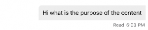 | 8 |
| userBubbleTopRightCornerRadius | Float | Top right Radius corner on the User bubble. Setting the radius to a value greater than 0.0 causes the bubble's layer to begin drawing rounded corners on its background. This attribute affects the bubble's masking and it's recommended to use a corner radius which is at max equals to half of the bubble's height. Setting a corner radius larger than half of the bubble's height will cause text to cut visually. | 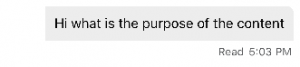 | 8 |
| userBubbleBottomLeftCornerRadius | Float | Bottom left Radius corner on the User bubble. Setting the radius to a value greater than 0.0 causes the bubble's layer to begin drawing rounded corners on its background. This attribute affects the bubble's masking and it's recommended to use a corner radius which is at max equals to half of the bubble's height. Setting a corner radius larger than half of the bubble's height will cause text to cut visually. | 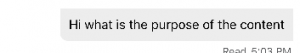 | 8 |
| userBubbleBottomRightCornerRadius | Float | Bottom right Radius corner on the User bubble. Setting the radius to a value greater than 0.0 causes the bubble's layer to begin drawing rounded corners on its background. This attribute affects the bubble's masking and it's recommended to use a corner radius which is at max equals to half of the bubble's height. Setting a corner radius larger than half of the bubble's height will cause text to cut visually. | 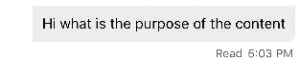 | 8 |
| bubbleEmailLinksRegex | String? | Regular expression for email hyperlinks in users messages (consumer and agent). This attribute is optional - If not assigned, the default link detection will be enabled. | nil | |
| bubbleUrlLinksRegex | String? | Regular expression for url hyperlinks in users messages (consumer and agent). This attribute is optional - If not assigned, the default link detection will be enabled. | nil | |
| bubblePhoneLinksRegex | String? | Regular expression for phone hyperlinks in users messages (consumer and agent). This attribute is optional - If not assigned, the default link detection will be enabled. | nil | |
| bubbleTopPadding | Float | Define the bubble Top Padding. | 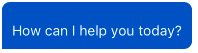 | 10 |
| bubbleBottomPadding | Float | Define the bubble bottom Padding. | 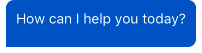 | 10 |
| bubbleLeadingPadding | Float | Define the bubble Leading Padding. | 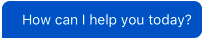 | 10 |
| bubbleTrailingPadding | Float | Define the bubble Trailing Padding. | 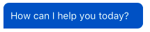 | 10 |
| bubbleTimestampBottomPadding | Float | Define the bubble Trailing Bottom Padding. | 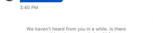 | 5 |
| bubbleTimestampTopPadding | Float | Define the bubble Timestamp Top Padding. | 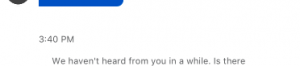 | 5 |
Link Preview
| New | Type | Description | Example | Default |
|---|---|---|---|---|
| enableLinkPreview | Bool | Enable or disable link preview feature. If disabled, user will not see site's link preview or link preview. | true | |
| linkPreviewBackgroundColor | UIColor | Color code for the background of the link preview area inside cell. | UIColor.white | |
| linkPreviewTitleTextColor | UIColor | Color code for the title text inside link preview area inside cell. | UIColor.black | |
| linkPreviewDescriptionTextColor | UIColor | Color code for the description text inside link preview area inside cell. | #5B5C5E | |
| linkPreviewSiteNameTextColor | UIColor | Color code for the description site name link preview area inside cell. | #E2E3E3 | |
| linkPreviewBorderWidth | Double | Double number for the outline width of link preview area inside cell. | 1.0 | |
| linkPreviewStyle | LPUrlPreviewStyle | Refers to the style in which the link preview cell will be displayed. | Slim: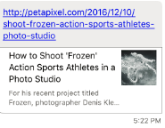 Large: 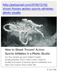 | LPUrlPreviewStyle.slim |
| linkPreviewSiteNameTextColor | UIColor | Color code for the description site name link preview area inside cell. | ||
| urlRealTimePreviewBackgroundColor | UIColor | The background color of the url real time preview. |  | UIColor.white |
| urlRealTimePreviewBorderColor | UIColor | The border color of the url real time preview. | 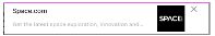 | |
| urlRealTimePreviewBorderWidth | Float | The border width of the url real time preview. |  | |
| urlRealTimePreviewTitleTextColor | UIColor | The title text color of the url real time preview. | 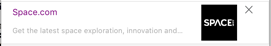 | |
| urlRealTimePreviewDescriptionTextColor | UIColor | The description text color of the url real time preview. |  | |
| useNonOGTagsForLinkPreview | Bool | urlPreview will also use non og tags to parse urls instead of using only og tags if useNonOGTagsForLinkPreview is true. | true |
Send Button
| Name | Type | Description | Example | Default |
|---|---|---|---|---|
| sendButtonDisabledColor | UIColor | Color code for Send and Camera (of Photo Sharing) buttons in disabled mode. | #AAAAAA | |
| sendButtonEnabledColor | UIColor | Color code for Send and Camera (of Photo Sharing) buttons in disabled mode. | #0362AC | |
| sendButtonImage | UIImage | Send button Image in the conversation screen. The custom image will be changed only if isSendMessageButtonInTextMode = false. the send button image needs to follow the Custom Icon documention (https://developer.apple.com/ios/human-interface-guidelines/icons-and-images/custom-icons/) |  | SDK bundle sendMessageIcon Icon |
| isSendMessageButtonInTextMode | Bool | Two options for send message button mode:
| Default mode is text |
System Messages
| Name | Type | Description | Example | Default |
|---|---|---|---|---|
| systemBubbleTextColor | UIColor | Color code for the text of the system messages. |  | UIColor.black |
Delivery Notifications
| Name | Type | Description | Example | Default |
|---|---|---|---|---|
| checkmarkVisibility | CheckmarksState(Integer Enum) | Checkmark visibility of the following options (type CheckmarksState): SentOnly - Show checkmarks for only Sent messages. SentAndAccepted - Show checkmarks for only Sent and Accepted messages. All - Show checkmarks for Sent, Accepted and Read messages. | CheckmarksState.All | |
| checkmarkReadColor | UIColor | Color of checkmark indication signs of Read messages. | 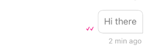 | #004DC9 |
| checkmarkDistributedColor | UIColor | Color of checkmark indication signs of Distributed messages. | 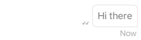 | #5B5C5E |
| checkmarkSentColor | UIColor | Color of checkmark indication signs of Sent messages. | #5B5C5E | |
| isReadReceiptTextMode | Bool | Two options for read indication:
If the parameter is set as False the mode will be Icon. | true |
Conversations
| Name | Type | Description | Example | Default |
|---|---|---|---|---|
| deleteClosedConversationOlderThanMonths | UInt | Upon SDK initialization, all closed conversations with an end date older than X months will be deleted from the database. Setting 0 will delete all closed conversations. | 13 | |
| sendingMessageTimeoutInMinutes | UInt | Maximum number of minutes to send the message. | 60 | |
| conversationSeparatorTextColor | UIColor | Conversation separator text and line color. | 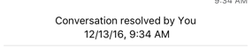 | UIColor.black |
| enableConversationSeparatorTextMessage | Bool | Toggle conversation separator text message when conversation resolved from agent or consumer. | | true |
| enableConversationSeparatorLine | Bool | Toggle conversation separator line when conversation resolved from agent or consumer. | | true |
| conversationSeparatorFontSize | UIFontTextStyle | Define the conversation closed separator font size. | 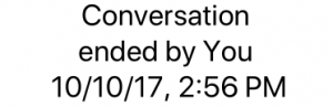 | UIFontTextStyle.caption1 |
| conversationSeparatorBottomPadding | Float | Define the conversation Closed label to separator line padding. |  | 7 |
| conversationSeparatorFontName | Float | Custom font name for conversation closed separator. Fonts that are not part of the iOS families, must be defined in App's Info.plist. | 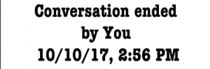 | 7 |
| conversationSeparatorViewBottomPadding | String | Define the conversation separator view bottom padding. |  | nil |
| conversationClosedSeparatorTopPadding | Float | Define the conversation closed separator top padding. | 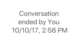 | 5 |
| enableVibrationOnMessageFromRemoteUser | Bool | Toggle vibration sound when a new message from a remote user is received. | false |
Unread Messages
| Name | Type | Description | Example | Default |
|---|---|---|---|---|
| scrollToBottomButtonBackgroundColor | UIColor | Scroll to bottom button background color of the whole button. | 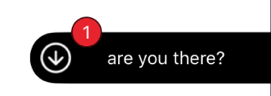 | UIColor.black |
| scrollToBottomButtonMessagePreviewTextColor | UIColor | Scroll to bottom button text color of the last unread message preview. | 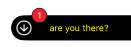 | UIColor.white |
| scrollToBottomButtonBadgeBackgroundColor | UIColor | Scroll to bottom button unread message badge background color. | 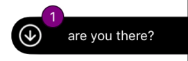 | #E7242D |
| scrollToBottomButtonBadgeTextColor | UIColor | Scroll to bottom button unread message badge text color. | 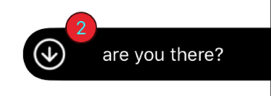 | UIColor.white |
| scrollToBottomButtonArrowColor | UIColor | Scroll to bottom button arrow tint color. | 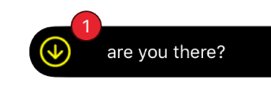 | UIColor.white |
| unreadMessagesDividerBackgroundColor | UIColor | Unread Messages divider background color. |  | #F5F5F5 |
| unreadMessagesDividerTextColor | UIColor | Unread Messages divider text color. | 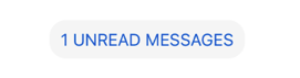 | #004DC9 |
| scrollToBottomButtonEnabled | Bool | Toggle the mode of the Scroll to bottom button. | true | |
| scrollToBottomButtonMessagePreviewEnabled | Bool | Toggle the mode of the Scroll to bottom unread message text preview. | true | |
| unreadMessagesDividerEnabled | Bool | Toggle the mode of the Unread Messages divider. If disabled, the scroll to bottom button will scroll to the bottom although we can have new messages and don't show the badge at all nor "new message preview". | true | |
| unreadMessagesCornersRadius | Float | Define the corners radius of the unread messages bubble. | 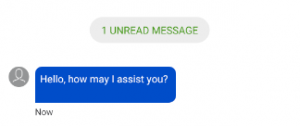 | 8 for all the corners |
| scrollToBottomButtonCornerRadius | Float | Define the left top and the left bottom corners radius of the scroll down indicator. |  | 20 for left top and the left bottom the corners |
| scrollToBottomButtonBadgeCornerRadius | Float | Define the corners radius of the unread messages counter inside the scroll down indicator. | 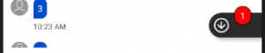 | 12 for all the corners |
Localization
| Name | Type | Description | Example | Default |
|---|---|---|---|---|
| country | String? | Country code: When it is not nil, it will be combined with 'language' ("language_country", for example: en_US) and used instead of device default locale when formatting date and time. If no value is provided, the SDK will use the country according to the device's locale. | nil | |
| language | LPLanguage | Language that will be used instead of default device language. Its type is LPLanguage enum that contains all the languages that are supported by MessagingSDK. It will affect the following areas: 1. Will be used when getting localized strings 2. Will be combined with 'country' ("language_country", for example: en_US) and used instead of default device locale when formatting time and date. If no value is provided, the SDK will use the device's language as default. | DeviceLanguage |
Brand
| Name | Type | Description | Example | Default |
|---|---|---|---|---|
| conversationBackgroundColor | UIColor | Color code for the entire view background. | UIColor.white | |
| customFontNameConversationFeed | String? | Custom font name for conversation feed. This font will affect all Messages, Timestamp and Separators. Fonts that are not part of the iOS families, must be defined in App's Info.plist. | 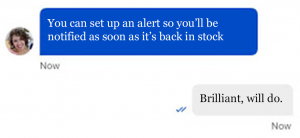 | nil |
| customFontNameNonConversationFeed | String? | Custom font name for all non conversation feed controls. Such as: Buttons, Alerts, Banners, Menu and External Windows. Fonts that are not part of the iOS families, must be defined in App's Info.plist. |  | nil |
| customRefreshControllerImagesArray | Array of images for creating the custom refresh controller the controller will loop the images from the array. You must select at least two images in the array to take effect. | nil | ||
| customRefreshControllerAnimationSpeed | Float | Custom refresh controller speed animation define the full images loop time. Smaller value will create high speed animation. | 2 |
Date Separator
| Name | Type | Description | Example | Default |
|---|---|---|---|---|
| dateSeparatorTitleBackgroundColor | UIColor | Color code for date separator title background color. |  | UIColor.white |
| dateSeparatorTextColor | UIColor | Color code for date separator text color. |  | #46474A |
| dateSeparatorLineBackgroundColor | UIColor | Color code for date separator line background color. | 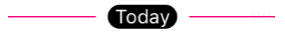 | UIColor.clear |
| dateSeparatorBackgroundColor | UIColor | Color code for date separator background color. |  | #FFFFFF |
| dateSeparatorFontSize | UIFontTextStyle | Define the Date Separator font text style. | 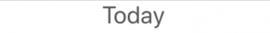 | UIFontTextStyle.footnote |
| customFontNameDateSeparator | String | Custom font name for Timestamp. Fonts that are not part of the iOS families must be defined in App's Info.plist. |  | nil |
| dateSeparatorTopPadding | Float | Define the Date Separator top padding. | 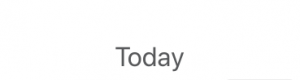 | 0 |
| dateSeparatorBottomPadding | Float | Define the Date Separator bottom padding. |  | 0 |
User Input View
| Name | Type | Description | Example | Default |
|---|---|---|---|---|
| inputTextViewContainerBackgroundColor | UIColor | User Input TextView container background color. |  | #F5F5F5 |
| inputTextViewCornerRadius | Double | User Input TextView corner radius. |  | 17.0 |
Date and Time
| Name | Type | Description | Example | Default |
|---|---|---|---|---|
| lpDateFormat | String? | Custom formatting for date string (day, year..), for example: 'd MMM'. If not defined, one of the default styles will be used (see timestamps formatting). | nil | |
| lpTimeFormat | String? | Custom formatting for time string (hours, lpDateTimeFormat minutes..), for example: 'hh:mm a'. If not defined, one of the default styles will be used (see timestamps formatting). | nil | |
| lpDateTimeFormat | String? | Custom formatting for date and time string, for example: 'EEEE MM/dd/YY hh:mm a'. If not defined, one of the default styles will be used (see timestamps formatting). | nil |
User Avatar
| Name | Type | Description | Example | Default |
|---|---|---|---|---|
| remoteUserAvatarBackgroundColor | UIColor | Background color of the remote user’s avatar. | #004DC9 | |
| remoteUserAvatarLeading | Float | Define the remote user’s avatar Leading padding (left edge to avatar). |  | 8 |
| remoteUserAvatarTrailingPadding | Float | Define the remote user’s avatar Trailing padding (avatar to bubble). |  | 8 |
| remoteUserAvatarIconColor | UIColor | Default avatar icon color of the remote user. | #0362AC | #FFFFFF |
| remoteUserDefaultAvatarImage | UIImage? | Default avatar image of the remote user. When assigned, this image will disable remoteUserAvatarBackgroundColor and remoteUserAvatarIconColor configurations. If remote user has an avatar image in his profile, this attribute will be ignored. | 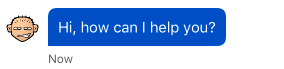 | nil |
| brandAvatarImage | UIImage? | Set avatar image for brand. This is an optional UIImage that if is set to nil a default avatar will be presented. Image ratio should be 1:1 (square) and at least 50x50 pixels. | nil |
Navigation
| Name | Type | Description | Example | Default |
|---|---|---|---|---|
| conversationNavigationBackgroundColor | UIColor | Background color of navigation bar in conversation screen. | #0362AC | |
| conversationNavigationTitleColor | UIColor | Navigation title color in conversation screen. | #FFFFFF | |
| conversationStatusBarStyle | UIStatusBarStyle | Status bar style in conversation screen. | .LightContent |
Connection Status Bar
| Name | Type | Description | Example | Default |
|---|---|---|---|---|
| connectionStatusConnectingBackgroundColor | UIColor | Color code for the background of the connection status bar while connecting. |  | #f5f5f5f2 |
| connectionStatusConnectingTextColor | UIColor | Color code for the text of the connection status bar while connecting. | | #46474a |
| connectionStatusFailedToConnectBackgroundColor | UIColor | Color code for the background of the connection status bar when connection failed. |  | #000000cc |
| connectionStatusFailedToConnectTextColor | UIColor | Color code for the text of the connection status bar when connection failed. | | UIColor.white |
Controller Message
| Name | Type | Description | Example | Default |
|---|---|---|---|---|
| controllerBubbleTextColor | UIColor | Color code for the text of the controller bubble. | 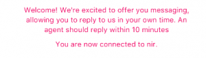 | #5b5c5e |