Responsive Web Site Support
If your website is responsive, you will want to follow these instructions for coding the style properties of the presence aware chat icons on your site and choose our specially modified dropin business cards that are specifically designed for responsive websites.
The key to making the button “responsive” is to use the max-width style property. In the example below, the presence icons are contained within div elements that are set to occupy only 25% of a given row. The button uses a class that sets max-width to 100%. Thus, the button will never be bigger than its parent (25% of the row) and will scale accordingly.
Sample CSS
<style type="text/css">
.DetailRow { width:100%; max-width: 100%; border: thick solid blue; }
.DetailBox { width:70%; border: thin solid black; float: left; }
.ButtonBox { max-width: 25%; float: right; }
.ScalablePresenceButton { max-width:100%; }
</style>
Example 1 – Code
<div class="DetailRow">
<div class="DetailBox">Here are some vehicle details. Can I make it really big ?</div>
<div class="ButtonBox"> <img class="ScalablePresenceButton" src="http://dm4.contactatonce.com/getagentstatusimage.aspx?MerchantId=10&ProviderId=17&PlacementId=1" /></div>
</div>Example 1 – Result
Example 2
Below is a sample of an offline icon, just to show that the default offline icon won’t scale up to fill the entire button box (because we are using max-width and not plain width).
Example 2 – Code
<div class="DetailRow" style="background-color:black">
<div class="DetailBox" style="background-color:White">Here are some vehicle details. This one is for an offline merchant. Using background in the button cell to show that small blank icon does not scale out with max-width.</div>
<div class="ButtonBox" style="background-color:Black;height:100%"><img class="ScalablePresenceButton" src="http://dm4.contactatonce.com/getagentstatusimage.aspx?MerchantId=NewTest&ProviderId=17&PlacementId=1" />
</div>
</div> Example 2 – Result
Example 3
Finally there is an example to show how more fine-grained responsiveness can be achieved with javascript. In the example we actually use a different placement id when the screen width is reduced past a certain point.
Example 3 – Code
<div class="DetailRow">
<div class="DetailBox">If you want to accomodate an image that does not scale down past a certain point, you can use javascript to alter placements based on viewport width. <u>Here we are just changing placements at document load time, could do it at document resize to get fully dynamic, but that is beyond the scope of this demo.</u></div>
<div class="ButtonBox"> <script type="text/javascript"> InsertFlexibleImageTag(10, 1);</script> </div>
</div>
Example 3 – Result
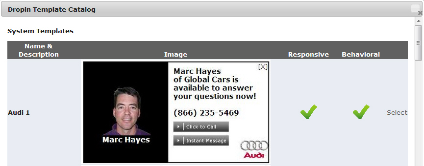
ContactAtOnce! has modified the most widely used Dropin Business card designs to work with responsive sites. The “responsive” version of the Dropin Business Card must be specifically selected in the portal. Follow these instructions to chose a responsive Dropin.
- Login to the ContactAtOnce Portal
- Navigate to the Settings/Manage Dropin page
- Click the “Select” link on the Template row to select from a list of available DropIn templates.
- Templates that work on responsive website will have a green check mark in the Responsive column as shown in the screen shot below.
- If you do not see a green check next to the template you would like to use, please contact our support team and make a request to have your desired template modified to support responsive.